import igraph
import numpy as np
import seaborn as sns
import matplotlib.pyplot as plt

# Create a Barabási-Albert network with 10,000 nodes
g = igraph.Graph.Barabasi(n=10000, m=1)
A = g.get_adjacency()Visualizing Degree Distributions in Python
1 Computing degree distributions from network data
We’ll start by creating a scale-free network using the Barabási-Albert model and computing its degree distribution. This model generates networks with power-law degree distributions, making it ideal for demonstrating visualization techniques that work well with heavy-tailed distributions.
The first step in analyzing any network is computing the degree sequence. In Python, we can extract degrees directly from the adjacency matrix by summing along rows (for undirected networks, row and column sums are identical). The flatten() method ensures we get a 1D array of degree values.
# Compute degree for each node
deg = np.sum(A, axis=1).flatten()

# Convert to probability distribution
p_deg = np.bincount(deg) / len(deg)
2 Why standard histograms fail for degree distributions
Let’s start with the obvious approach—a simple histogram. This immediately reveals why degree distribution visualization is challenging.
fig, ax = plt.subplots(figsize=(8, 5))
ax = sns.lineplot(x=np.arange(len(p_deg)), y=p_deg)
ax.set_xlabel('Degree')
ax.set_ylabel('Probability')
ax.set_title('Linear Scale: Most Information Hidden')
Text(0.5, 1.0, 'Linear Scale: Most Information Hidden')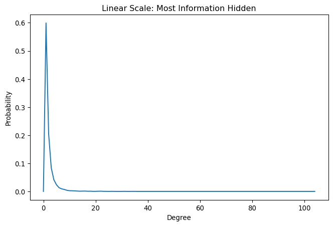
This linear-scale plot shows the fundamental problem: most nodes cluster at low degrees, making the interesting high-degree tail invisible. Since power-law networks have heavy tails—a few nodes with very high degrees—we need visualization techniques that can handle this extreme heterogeneity.
3 Log-log plots: revealing the power-law structure
Switching to logarithmic scales on both axes dramatically improves visibility across the entire degree range. This transformation is essential for identifying power-law behavior, which appears as straight lines in log-log space.
fig, ax = plt.subplots(figsize=(8, 5))
ax = sns.lineplot(x=np.arange(len(p_deg)), y=p_deg)
ax.set_xscale('log')
ax.set_yscale('log')
ax.set_ylim(np.min(p_deg[p_deg>0])*0.01, None)
ax.set_xlabel('Degree')
ax.set_ylabel('Probability')
ax.set_title('Log-Log Scale: Structure Revealed')
Text(0.5, 1.0, 'Log-Log Scale: Structure Revealed')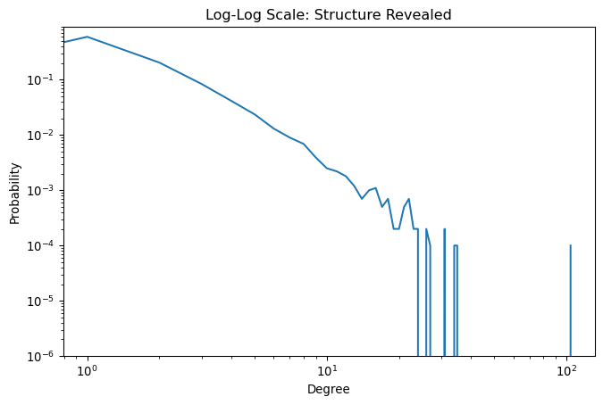
The log-log plot reveals the power-law structure, but notice the noisy fluctuations at high degrees. This noise occurs because only a few nodes have very high degrees, leading to statistical fluctuations. While binning could smooth these fluctuations, it introduces arbitrary choices about bin sizes and loses information.
4 The CCDF approach: smooth curves without binning
The complementary cumulative distribution function (CCDF) provides a superior visualization method. Instead of plotting the fraction of nodes with exactly degree k, CCDF plots the fraction with degree greater than k. This approach naturally smooths the data without requiring binning decisions.
# Compute CCDF: fraction of nodes with degree > k
ccdf_deg = 1 - np.cumsum(p_deg)[:-1]  # Exclude last element (always 0)

fig, ax = plt.subplots(figsize=(8, 5))
ax = sns.lineplot(x=np.arange(len(ccdf_deg)), y=ccdf_deg)
ax.set_xscale('log')
ax.set_yscale('log')
ax.set_xlabel('Degree')
ax.set_ylabel('CCDF')
ax.set_title('CCDF: Smooth Power-Law Visualization')
Text(0.5, 1.0, 'CCDF: Smooth Power-Law Visualization')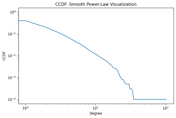
The CCDF produces clean, interpretable curves even for noisy data. The slope directly relates to the power-law exponent: steeper slopes indicate more homogeneous degree distributions (fewer hubs), while flatter slopes suggest more heterogeneous distributions (more extreme hubs). This visualization technique has become the standard in network science for analyzing heavy-tailed distributions.
5 Implementing the friendship paradox
Now let’s demonstrate the friendship paradox computationally. As covered in the concepts module, this phenomenon arises because high-degree nodes are more likely to be someone’s friend than low-degree nodes. We’ll implement this by sampling friends through edge-based sampling.
To capture this bias, we need to sample edges rather than nodes. When we sample an edge uniformly at random, we’re effectively sampling one endpoint of that edge—this gives us a “friend” from someone’s perspective. The key insight is that nodes with higher degrees appear as endpoints more frequently, creating the degree bias that drives the friendship paradox.
from scipy import sparse

# Extract all edges from the adjacency matrix
src, trg, _ = sparse.find(A)
print(f"Total number of edges: {len(src)}")
print(f"First few source nodes: {src[:10]}")
print(f"First few target nodes: {trg[:10]}")
Total number of edges: 19998
First few source nodes: [0 0 0 0 0 0 0 0 0 0]
First few target nodes: [ 1 24 242 555 1385 1885 2254 2521 2654 5133]The sparse.find() function returns three arrays: source nodes, target nodes, and edge weights. Since we’re working with an unweighted network, we ignore the weights. Each edge appears twice in an undirected network (once as src→trg and once as trg→src), which is exactly what we want for sampling friends.
Now we can compute the degree distribution of friends by taking the degrees of the source nodes from our edge list. This automatically implements the degree-biased sampling because high-degree nodes appear more frequently in the source node list.
# Get degrees of "friends" (source nodes from edge sampling)
deg_friend = deg[src]

# Compute degree distribution of friends
p_deg_friend = np.bincount(deg_friend) / len(deg_friend)

print(f"Average degree in network: {np.mean(deg):.2f}")
print(f"Average degree of friends: {np.mean(deg_friend):.2f}")
print(f"Friendship paradox ratio: {np.mean(deg_friend) / np.mean(deg):.2f}")
Average degree in network: 2.00
Average degree of friends: 4.87
Friendship paradox ratio: 2.446 Visualizing the degree bias
Let’s create a side-by-side comparison of both distributions using CCDF plots. This clearly shows how the friendship paradox manifests as a shift toward higher degrees in the friend distribution.
# Compute CCDFs for both distributions
ccdf_deg = 1 - np.cumsum(p_deg)[:-1]
ccdf_deg_friend = 1 - np.cumsum(p_deg_friend)[:-1]

# Create comparison plot
fig, ax = plt.subplots(figsize=(10, 6))
ax = sns.lineplot(x=np.arange(len(ccdf_deg)), y=ccdf_deg,
                  label='Regular nodes', linewidth=2, color='blue')
ax = sns.lineplot(x=np.arange(len(ccdf_deg_friend)), y=ccdf_deg_friend,
                  label='Friends (degree-biased)', linewidth=2, color='red', ax=ax)

ax.set_xscale('log')
ax.set_yscale('log')
ax.set_xlabel('Degree')
ax.set_ylabel('CCDF')
ax.set_title('Friendship Paradox: Friends Have Higher Degrees')
ax.legend(frameon=False)
ax.grid(True, alpha=0.3)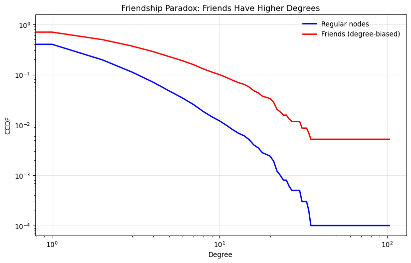
The plot clearly demonstrates the friendship paradox: the friend distribution (red line) lies below the node distribution (blue line), indicating that friends have systematically higher degrees. The flatter slope of the friend CCDF shows that the probability of encountering high-degree friends is much higher than encountering high-degree nodes when sampling uniformly.
This computational demonstration confirms the theoretical prediction that your friends will, on average, have more friends than you do. The magnitude of this effect depends on the heterogeneity of the degree distribution—the more heterogeneous the network, the stronger the friendship paradox becomes.