import igraph
import matplotlib.pyplot as plt
fig, ax = plt.subplots(figsize=(10, 8))
g = igraph.Graph.Famous("Zachary")
igraph.plot(g, target=ax, vertex_size=20)
plt.axis('off')
plt.tight_layout()
plt.show()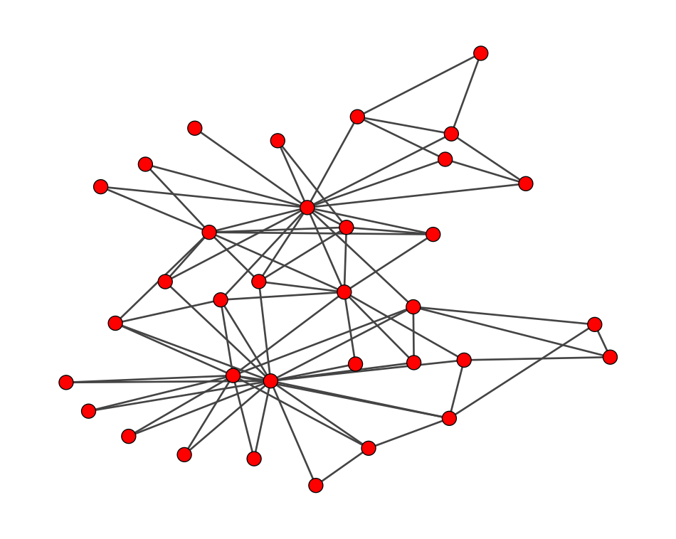
# If you are using Google Colab, uncomment the following line to install igraph
#!sudo apt install libcairo2-dev pkg-config python3-dev
#!pip install pycairo cairocffi
#!pip install igraphLet us showcase how to use igraph to detect communities with modularity. We will use the Karate Club Network as an example.
import igraph
import matplotlib.pyplot as plt

fig, ax = plt.subplots(figsize=(10, 8))
g = igraph.Graph.Famous("Zachary")
igraph.plot(g, target=ax, vertex_size=20)
plt.axis('off')
plt.tight_layout()
plt.show()
When it comes to maximizing modularity, there are a variety of algorithms to choose from. Two of the most popular ones are the Louvain and Leiden algorithms, both of which are implemented in igraph. The Louvain algorithm has been around for quite some time and is a classic choice, while the Leiden algorithm is a newer bee that often yields better accuracy. For our example, we’ll be using the Leiden algorithm, and I think you’ll find it really effective!
communities = g.community_leiden(resolution=1, objective_function= "modularity")What is resolution? It is a parameter that helps us tackle the resolution limit of the modularity maximization algorithm {footcite}fortunato2007resolution! In simple terms, when we use the resolution parameter \rho, the modularity formula can be rewritten as follow:
Q(M) = \frac{1}{2m} \sum_{i=1}^n \sum_{j=1}^n \left(A_{ij} - \rho \frac{k_i k_j}{2m}\right) \delta(c_i, c_j)
Here, the parameter \rho plays a crucial role in balancing the positive and negative parts of the equation. The resolution limit comes into play because of the diminishing effect of the negative term as the number of edges m increases. The parameter \rho can adjust this balance and allow us to circumvent the resolution limit.
What is communities? This is a list of communities, where each community is represented by a list of nodes by their indices.
print(communities.membership)[0, 0, 0, 0, 1, 1, 1, 0, 2, 2, 1, 0, 0, 0, 2, 2, 1, 0, 2, 0, 2, 0, 2, 3, 3, 3, 2, 3, 3, 2, 2, 3, 2, 2]Let us visualize the communities by coloring the nodes in the graph.
import seaborn as sns
community_membership = communities.membership
palette = sns.color_palette().as_hex()
fig, ax = plt.subplots(figsize=(10, 8))
igraph.plot(g, target=ax, vertex_color=[palette[i] for i in community_membership])
plt.axis('off')
plt.tight_layout()
plt.show()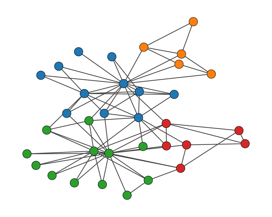
community_membership: This is a list of community membership for each node.palette: This is a list of colors to use for the communities.igraph.plot(g, vertex_color=[palette[i] for i in community_membership]): This plots the graph ‘g’ with nodes colored by their community.Let us turn the SBM as our community detection tool using graph-tool. This is a powerful library for network analysis, with a focus on the stochastic block model.
#
# Uncomment the following code if you are using Google Colab
#
#!wget https://downloads.skewed.de/skewed-keyring/skewed-keyring_1.0_all_$(lsb_release -s -c).deb
#!dpkg -i skewed-keyring_1.0_all_$(lsb_release -s -c).deb
#!echo "deb [signed-by=/usr/share/keyrings/skewed-keyring.gpg] https://downloads.skewed.de/apt $(lsb_release -s -c) main" > /etc/apt/sources.list.d/skewed.list
#!apt-get update
#!apt-get install python3-graph-tool python3-matplotlib python3-cairo
#!apt purge python3-cairo
#!apt install libcairo2-dev pkg-config python3-dev
#!pip install --force-reinstall pycairo
#!pip install zstandard
We will identify the communities using the stochastic block model as follows. First, we will convert the graph object in igraph to that in graph-tool.
import graph_tool.all  as gt
import numpy as np
import igraph

# igraph object
g = igraph.Graph.Famous("Zachary")

# Set random seed for reproducibility
np.random.seed(42)

# Convert the graph object in igraph to that in graph-tool
edges = g.get_edgelist()
r, c = zip(*edges)
g_gt = gt.Graph(directed=False)
g_gt.add_edge_list(np.vstack([r, c]).T)
Then, we will fit the stochastic block model to the graph.
# Fit the stochastic block model
state = gt.minimize_blockmodel_dl(
     g_gt,
     state_args={"deg_corr": False, "B_min":2, "B_max":10},
)
b = state.get_blocks()
B_min and B_max are the minimum and maximum number of communities to consider.deg_corr is a boolean flag to switch to the degree-corrected SBM {footcite}karrer2011stochastic.Here’s a fun fact: the likelihood maximization on its own can’t figure out how many communities there should be. But graph-tool has a clever trick to circumvent this limitation. graph-tool actually fits multiple SBMs, each with a different number of communities. Then, it picks the most plausible one based on a model selection criterion.
Let’s visualize the communities to see what we got.
# Convert the block assignments to a list
community_membership = b.get_array()

# The community labels may consist of non-consecutive integers, e.g., 10, 8, 1, 4, ...
# So we reassign the community labels to be 0, 1, 2, ...
community_membership = np.unique(community_membership, return_inverse=True)[1]
community_membership
array([0, 0, 0, 1, 1, 1, 1, 1, 1, 1, 1, 1, 1, 1, 1, 1, 1, 1, 1, 1, 1, 1,
1, 1, 1, 1, 1, 1, 1, 1, 1, 1, 2, 2])# Create a color palette
palette = sns.color_palette().as_hex()
# Plot the graph with nodes colored by their community
fig, ax = plt.subplots(figsize=(10, 8))
igraph.plot(
g,
target=ax,
vertex_color=[palette[i] for i in community_membership],
)
plt.axis('off')
plt.tight_layout()
plt.show()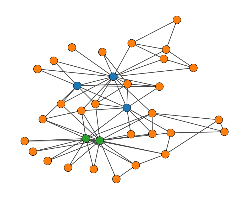
What we’re seeing here isn’t a failure at all. In fact, it’s the best partition according to our stochastic block model. The model has discovered something called a core-periphery structure (Borgatti and Everett 2000). Let me break that down:
That’s exactly what our model found in this network.
If we look at the adjacency matrix, we would see something that looks like an upside-down “L”. This shape is like a signature for core-periphery structures.
# Convert igraph Graph to adjacency matrix
A = np.array(g.get_adjacency().data)

# Sort nodes based on their community (core first, then periphery)
sorted_indices = np.argsort(community_membership)
A_sorted = A[sorted_indices][:, sorted_indices]

# Plot the sorted adjacency matrix
plt.figure(figsize=(10, 8))
plt.imshow(A_sorted, cmap='binary')
plt.title("Sorted Adjacency Matrix: Core-Periphery Structure")
plt.xlabel("Node Index (sorted)")
plt.ylabel("Node Index (sorted)")

plt.tight_layout()
plt.show()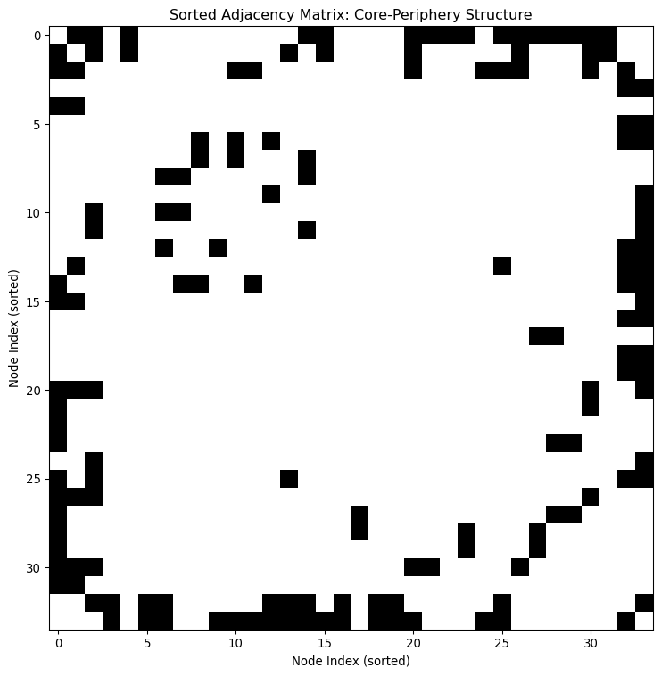
To account for