Visualizing One-Dimensional Data: Show Me the Data!
What you’ll learn in this module
This module teaches you how to visualize one-dimensional data honestly and clearly.
You’ll learn:
Why hiding raw data behind summary statistics is misleading and how to show all the data whenever possible.
How to use swarm plots, strip plots, and barcode plots to visualize individual data points effectively.
The principles of histograms and kernel density estimation for summarizing distributions.
How cumulative distribution functions reveal patterns in heavy-tailed data without arbitrary parameter choices.
Practical strategies for choosing the right visualization based on your dataset’s size and characteristics.
The Case of the Missing Data Points
Imagine you’re reading a research paper that claims “Treatment A is significantly better than Treatment B.” The paper shows a bar chart with two bars and error bars. The difference looks impressive. But here’s the question: what does the actual data look like? Are there 5 data points per group? 500? Are they normally distributed, or are there outliers? Are most points clustered together, or spread out?
Without seeing the raw data, you’re flying blind. And unfortunately, many scientific papers and reports make this same mistake: they summarize data without showing it.
The golden rule of data visualization: Show all the data, whenever possible.
Why Showing All Data Matters
In 2016, a group of researchers analyzed 118 papers in leading neuroscience journals and found something disturbing: when they requested the raw data and re-analyzed it, they found that the bar charts in many papers were misleading. The bar charts suggested clear differences between groups, but the raw data often told a different story. There was substantial overlap between groups, unexpected distributions, or influential outliers.
This isn’t about fraud. It’s about the limitations of summary statistics. When you reduce your data to a mean and a standard error, you lose a tremendous amount of information. The data might be bimodal, skewed, or contain outliers. These patterns are invisible in a bar chart, but they’re crucial for understanding what’s really going on.
Dynamite Plots Must Die
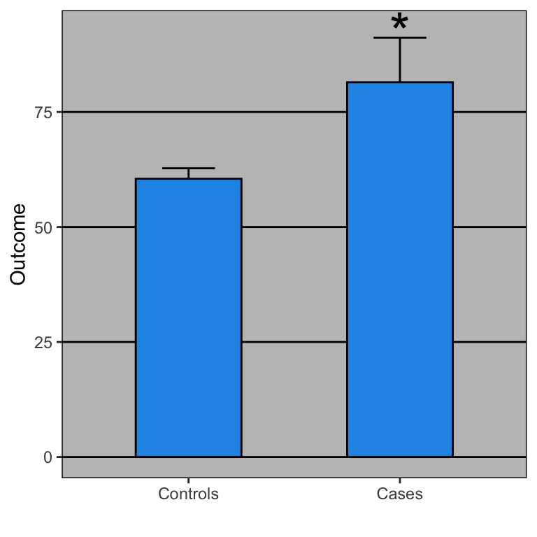
Statisticians have been campaigning against bar charts with error bars—called “dynamite plots”—for years. Yet a systematic review found that 85.6% of papers in top physiology journals still use them. They appear everywhere: Nature, Science, Cell.
Why is this a problem? A dynamite plot shows you exactly four numbers (two means and two standard errors), regardless of sample size. But worse, completely different datasets produce identical bar charts. A dataset with outliers, a uniform distribution, or a bimodal distribution can all generate the same plot.
When Rafael Irizarry showed the actual data behind a blood pressure comparison, the story changed dramatically. The bar chart showed a clear, significant difference. But the raw data revealed an extreme outlier (possibly a data entry error) and substantial overlap between groups. Remove that single outlier, and the result was no longer significant.
As Irizarry put it in his open letter to journal editors: dynamite plots conceal the data rather than showing it. The solution? Show the actual data points whenever possible, and use distributions (boxplots, histograms, density plots) when you can’t.
Start Simple: Show Every Point
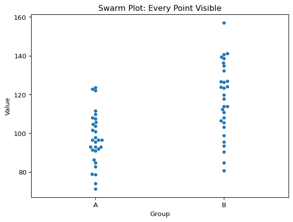
Swarm Plots (Beeswarm Plots)
The most straightforward approach is to plot every single data point. A swarm plot (also called a beeswarm plot) does exactly this: it displays each observation as a point, with points arranged to avoid overlap.
Code
import seaborn as snsimport matplotlib.pyplot as pltimport numpy as np# Generate sample datanp.random.seed(42)group_a = np.random.normal(100, 15, 30)group_b = np.random.normal(120, 20, 30)data = {'Value': np.concatenate([group_a, group_b]),'Group': ['A']*30+ ['B']*30}# Create swarm plotsns.swarmplot(data=data, x='Group', y='Value')plt.title('Swarm Plot: Every Point Visible')plt.show()
Swarm plot: Every point visible
Swarm plots are perfect for small to moderate datasets (roughly up to 100-200 points per group). They let you see the actual sample size, so you know how much data went into each group. You can immediately perceive the distribution shape, spotting whether your data is symmetric, skewed, or bimodal. Individual outliers jump out visually, rather than being hidden in summary statistics. And you can see the overall spread of the data with a single glance.
The Limits of Swarm Plots
But what happens when you have more data? With hundreds or thousands of points, swarm plots become cluttered and difficult to read. The points start to pile up, and the plot becomes a blob. This is where we need more sophisticated techniques.
Handling More Data: Transparency and Jittering
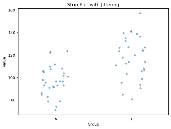
Strip Plots with Jittering
When you have too many points for a swarm plot, a strip plot with jittering can help. Instead of carefully arranging points to avoid overlap, we add random noise (jitter) to the x-position of each point.
Code
sns.stripplot(data=data, x='Group', y='Value', alpha=0.6, jitter=0.2)plt.title('Strip Plot with Jittering')plt.show()
Strip plot with jittering
Two key parameters control the appearance. The alpha parameter controls transparency (0 = invisible, 1 = opaque), and values around 0.3-0.7 work well to see overlapping points. The jitter parameter controls the amount of random horizontal displacement. Too much jitter and your groups start to overlap and become confusing, while too little and points stack vertically in dense columns.
Barcode Plots (Rug Plots)
For even larger datasets, consider a barcode plot (also called a rug plot). This shows each data point as a small vertical tick mark along an axis. It’s minimalist but effective for showing the distribution of many points.
Barcode plots work well when you have thousands of points and want to show density patterns without losing the “raw data” feel.
Summarizing Distributions: Histograms
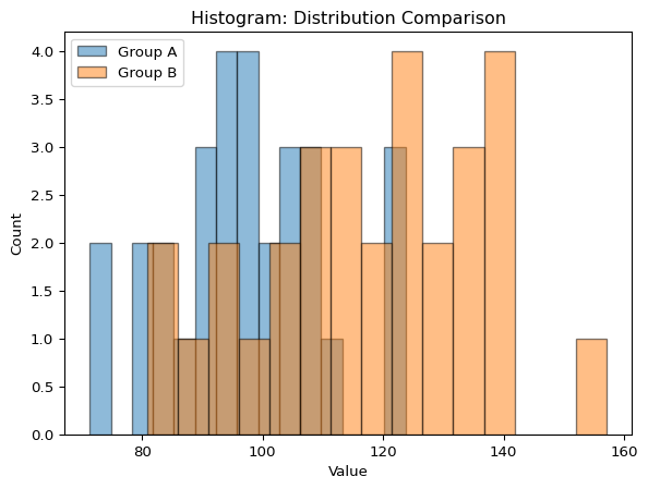
When your dataset is large enough that individual points become impractical to show, you need to summarize the distribution. The most common approach is the histogram.
A histogram divides your data range into bins and counts how many observations fall into each bin. It’s a powerful tool for understanding the shape of your distribution.
The number of bins dramatically affects how your histogram looks. With too few bins, you lose detail and might miss important features like bimodality. With too many bins, the histogram becomes noisy and hard to interpret.
A good starting point is the Sturges’ rule: number of bins = \log_2(n) + 1, where n is the sample size. But always experiment! Try different bin numbers and see what reveals the most about your data’s structure.
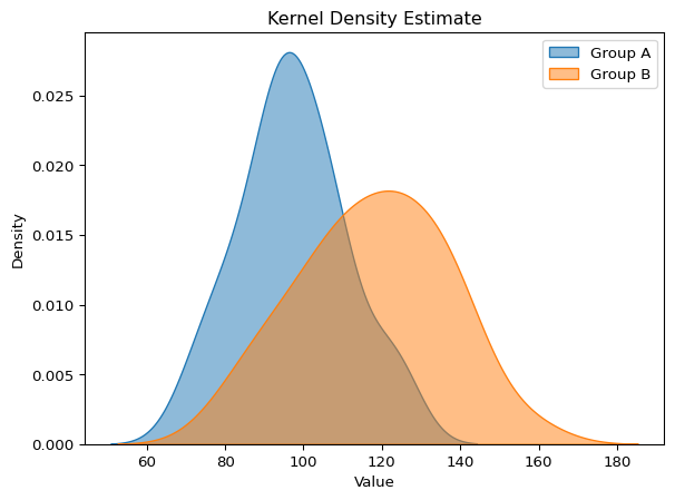
Smooth Alternatives: Kernel Density Estimation
Histograms have a problem: they’re sensitive to bin width and bin placement. Move your bins slightly, and the histogram can look quite different.
Kernel Density Estimation (KDE) provides a smooth alternative. Instead of binning, KDE places a small “kernel” (usually a Gaussian curve) at each data point and sums them up. The result is a smooth density curve.
KDE plots are elegant and reveal the shape of your distribution without the arbitrary choices of histograms. However, they can be misleading at the edges of your data and may suggest data exists where it doesn’t.
For Heavy-Tailed Data: Cumulative Distributions
Some data are extremely heterogeneous. Think income distributions, city populations, or earthquake magnitudes. These distributions often have heavy tails: most values are small, but a few are enormous.
For this kind of data, histograms and KDE plots can be misleading because they compress the tail into a tiny region of the plot.
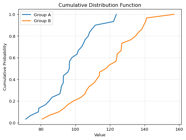
Cumulative Distribution Function (CDF)
The cumulative distribution function shows the proportion of data points less than or equal to each value. Instead of asking “how many points are in this bin?”, the CDF asks “what fraction of points are below this value?”
The CDF is a density estimation method that requires no parameter choices. Unlike histograms (which require bin size) or KDE (which requires bandwidth), the CDF is completely determined by your data. There are no arbitrary decisions that change how your data looks—making it one of the most honest ways to visualize a distribution.
The CDF has several advantages. First, there are no binning decisions to make, so every data point is effectively shown. Second, percentiles are easy to read: the median is where CDF = 0.5, and any other percentile is easy to find. Third, it’s great for comparisons because differences between groups are easy to spot visually.
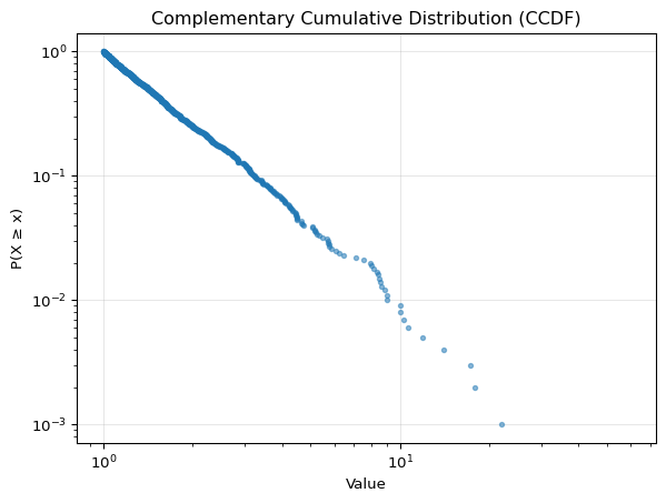
Complementary Cumulative Distribution Function (CCDF)
For heavy-tailed distributions, the complementary cumulative distribution function (CCDF) is even more useful. The CCDF shows the proportion of data points greater than each value: CCDF(x) = 1 - CDF(x).
The magic of the CCDF is that when plotted on a log-log scale, power-law distributions appear as straight lines. This makes it the go-to tool for studying phenomena with power-law behavior. Think income and wealth distributions, city size distributions, social network degree distributions, and earthquake magnitudes. All of these follow power-law patterns where the tail is as important as the bulk of the distribution.
The CCDF reveals the tail behavior that’s invisible in traditional histograms. For heterogeneous, heavy-tailed data, it’s an essential tool.
Choosing the Right Visualization
Here’s a quick decision guide:
Scenario
Best Visualization
Why
< 100 points per group
Swarm plot
Shows every data point clearly
100-500 points
Strip plot with jitter + transparency
Manageable with some overlap
500-5000 points
Histogram or KDE + rug plot
Need summary but show raw data on axis
> 5000 points
KDE or histogram alone
Too many points to show individually
Heavy-tailed/heterogeneous
CCDF (log-log scale)
Reveals tail behavior
Comparing distributions
CDF or overlaid KDE
Easy to spot differences
The Bigger Picture
The methods you choose to visualize your data aren’t just aesthetic choices. They’re scientific choices. Different visualizations reveal different aspects of your data, and some can hide important patterns.
By starting with the raw data and building up to summaries, you ensure that you understand what you’re working with. And by showing your data (not just summarizing it), you allow others to draw their own conclusions.