This module teaches how to visualize relationships between two variables.
You’ll learn:
What scatter plots reveal about relationships and how to handle overlapping points with transparency and jittering.
How binning methods (heatmaps, hexbin plots) make sense of massive datasets where individual points disappear.
The power of density estimation techniques like 2D KDE and contour plots for smooth, assumption-light visualization.
Practical strategies for comparing relationships across groups without misleading your audience.
You’ve probably heard that “correlation doesn’t equal causation.” Here’s an even more fundamental problem: a correlation coefficient doesn’t tell you what your data actually looks like.
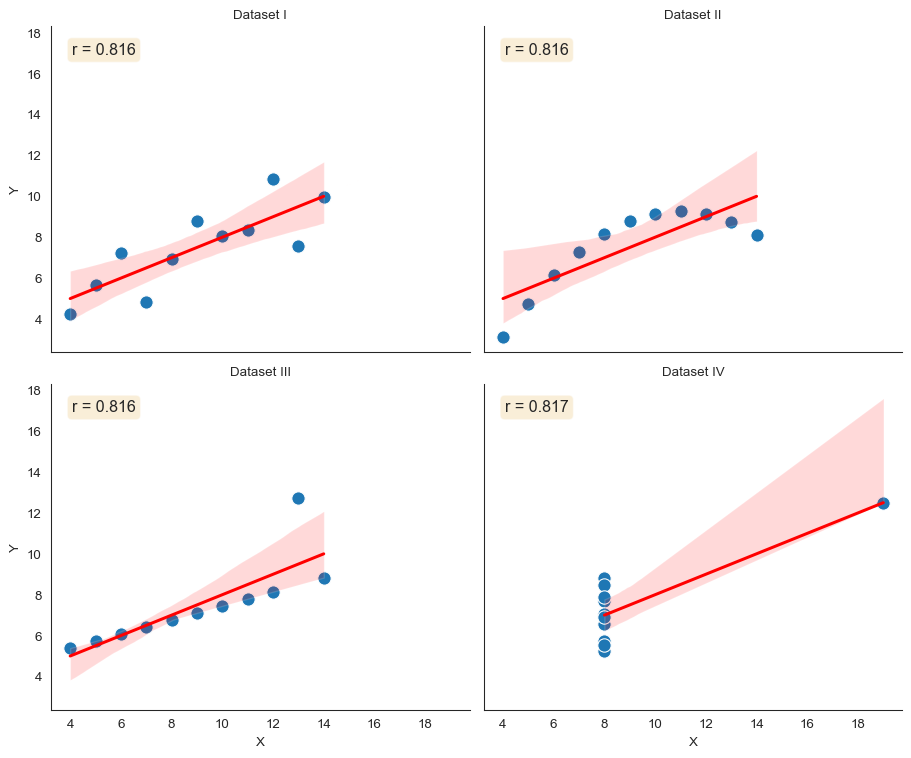
Let’s talk about one of the most famous examples in data visualization. In 1973, statistician Francis Anscombe created four datasets that shattered the myth of summary statistics.
Each dataset has 11 (x, y) pairs. Each has identical means, variances, correlation coefficients (r = 0.816), and linear regression lines. Identical on paper.
But when you plot them? Completely different stories.
Code
import seaborn as snsimport matplotlib.pyplot as pltimport numpy as npimport pandas as pd# Load Anscombe's quartetanscombe = sns.load_dataset("anscombe")# Create the plotsns.set_style("white")g = sns.FacetGrid(anscombe, col="dataset", col_wrap=2, height=4, aspect=1.2)g.map_dataframe(sns.scatterplot, x="x", y="y", s=100)g.map_dataframe(sns.regplot, x="x", y="y", scatter=False, color="red")g.set_axis_labels("X", "Y")g.set_titles("Dataset {col_name}")# Add correlation to each subplotfor ax, dataset inzip(g.axes.flat, ["I", "II", "III", "IV"]): data_subset = anscombe[anscombe["dataset"] == dataset] r = np.corrcoef(data_subset["x"], data_subset["y"])[0, 1] ax.text(0.05, 0.95, f'r = {r:.3f}', transform=ax.transAxes, verticalalignment='top', fontsize=12, bbox=dict(boxstyle='round', facecolor='wheat', alpha=0.5))sns.despine()plt.tight_layout()
Anscombe’s Quartet: Four datasets with identical summary statistics but completely different relationships
Look at what the plots reveal. Dataset I shows a nice linear relationship. Dataset II? Clearly non-linear. It’s a parabola that a linear model completely misses.
Dataset III has a perfect linear relationship except for one outlier that changes everything. Dataset IV shows no relationship at all. A single influential point creates the illusion of correlation.
Same statistics. Same regression line. Completely different data.
This is why we visualize relationships. Always plot your bivariate data. Summary statistics conceal structure.
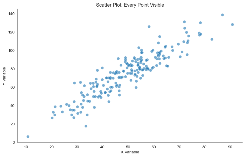
Showing All Points: Scatter Plots
Let’s start with the most direct way to show a relationship between two variables. A scatter plot plots every point, so each observation becomes a single dot in 2D space.
Code
# Generate sample data with clear relationshipnp.random.seed(42)n_points =200x = np.random.normal(50, 15, n_points)y =1.5* x + np.random.normal(0, 10, n_points)fig, ax = plt.subplots(figsize=(10, 6))ax.scatter(x, y, alpha=0.6, s=50, edgecolors='white', linewidth=0.5)ax.set_xlabel('X Variable')ax.set_ylabel('Y Variable')ax.set_title('Scatter Plot: Every Point Visible')sns.despine()
Basic scatter plot showing relationship between two variables
For small to moderate datasets (up to roughly 1,000 points), scatter plots are perfect. You can see everything at once: the relationship’s strength and direction, the spread around the trend, individual outliers, non-linear patterns, clusters, and subgroups.
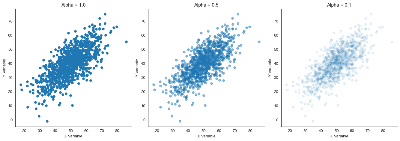
What happens when points overlap heavily? Use transparency (alpha).
Transparency creates natural density shading. Areas with many overlapping points appear darker. Sparse areas appear lighter.
Scatter plots with different alpha values showing how transparency reveals density
Look at the difference. With alpha = 1.0 (opaque), the center is a solid blob. You can’t tell if there are 10 points or 100.
With alpha = 0.1, the density gradient becomes visible. Dark regions have many points. Light regions have few.
Note
A figure from Metaanalysis of faculty’s teaching effectiveness showing the relationship between student evaluation of teaching and actual learning. Each bubble represents a course section, with size proportional to the number of students. Notice how transparency reveals the density of observations.
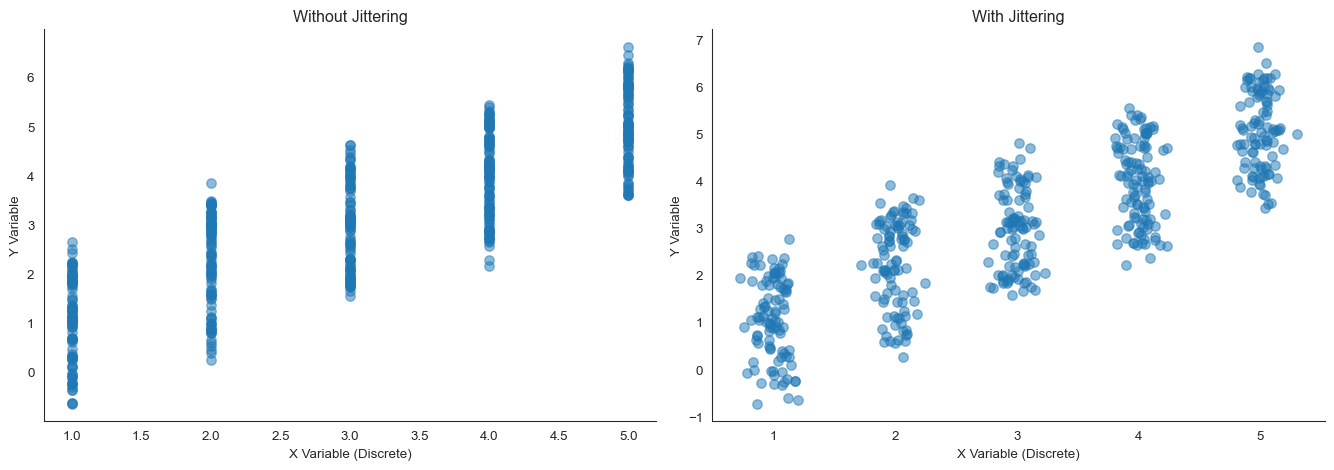
What if even transparency doesn’t help? For extremely dense data, jittering can separate overlapping points.
Jittering adds small random noise to point positions. This spreads them out while keeping their relative positions meaningful.
Jittering helps separate discrete or overlapping points
See the problem? Without jittering, many points stack on top of each other. You might think there are only 25 data points (5 times 5) when there are actually 500.
Jittering reveals the true sample size and density at each location.
When Points Overlap: Binning Methods
What happens when you have tens of thousands of points? Even transparency and jittering don’t fully reveal the density structure.
Shift your attention from individual points to the overall pattern. This is when we need to bin the data.
Binning divides the 2D space into regions and counts observations in each region. Think of it as creating a grid over your data and counting how many points fall in each cell.
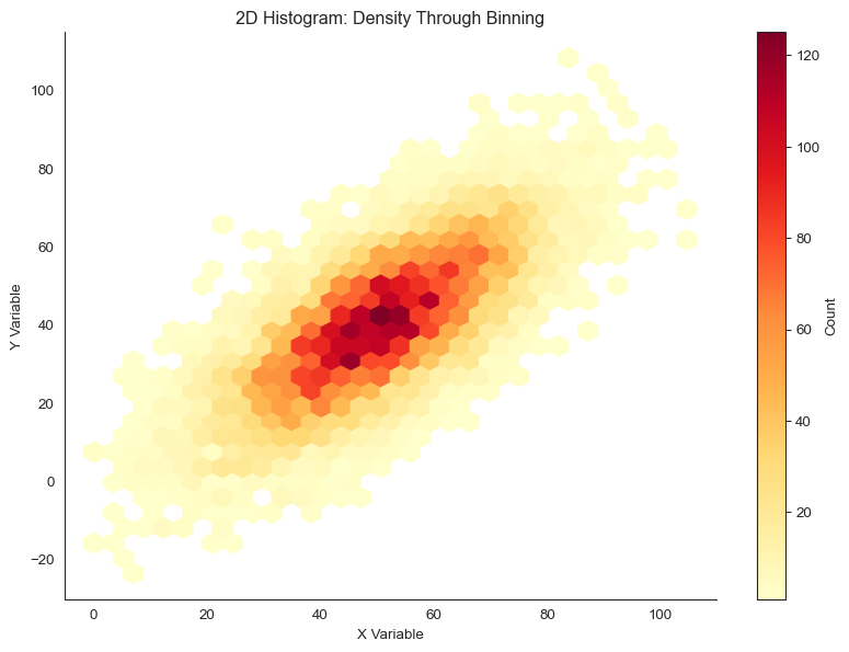
2D Histograms (Heatmaps)
A 2D histogram extends the 1D histogram concept to two dimensions. The plane is divided into rectangular bins, and each bin’s color represents the number of points it contains.
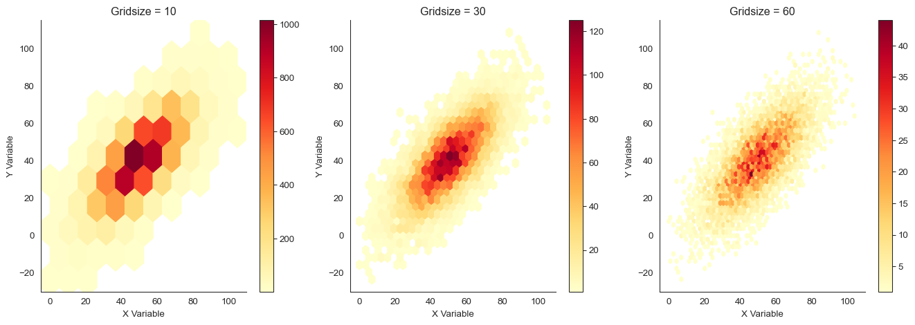
Look at the trade-off. With gridsize = 10, we see only coarse structure. With gridsize = 60, the plot is noisy. Some bins have few points just by chance.
Gridsize = 30 provides a good balance between detail and stability.
Hexbin Plots
Why use rectangles when hexagons are better? Hexagonal binning uses hexagons instead of rectangles.
Hexagons are closer to circles. Every edge is equidistant from the center. This reduces bias in how we perceive density.
Code
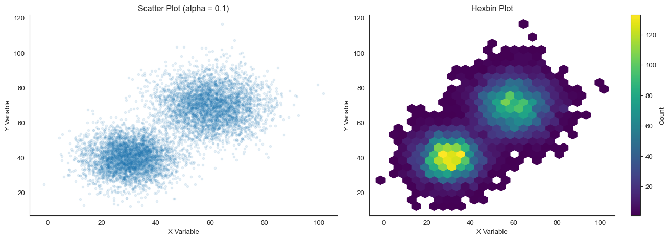
# Generate data with interesting structurenp.random.seed(101)n =8000# Create two clusterscluster1_x = np.random.normal(30, 8, n //2)cluster1_y = np.random.normal(40, 8, n //2)cluster2_x = np.random.normal(60, 10, n //2)cluster2_y = np.random.normal(70, 10, n //2)x_clusters = np.concatenate([cluster1_x, cluster2_x])y_clusters = np.concatenate([cluster1_y, cluster2_y])fig, axes = plt.subplots(1, 2, figsize=(14, 5))# Scatter plot (for reference)axes[0].scatter(x_clusters, y_clusters, alpha=0.1, s=10)axes[0].set_xlabel('X Variable')axes[0].set_ylabel('Y Variable')axes[0].set_title('Scatter Plot (alpha = 0.1)')sns.despine(ax=axes[0])# Hexbin plothb = axes[1].hexbin(x_clusters, y_clusters, gridsize=25, cmap='viridis', mincnt=1)axes[1].set_xlabel('X Variable')axes[1].set_ylabel('Y Variable')axes[1].set_title('Hexbin Plot')plt.colorbar(hb, ax=axes[1], label='Count')sns.despine(ax=axes[1])plt.tight_layout()
Hexbin plot provides more perceptually uniform density representation
The hexbin plot clearly reveals the two clusters and their relative densities. That’s harder to see in the scatter plot, even with low alpha.
Hexbin plots are particularly powerful for very large datasets (100,000+ points). At that scale, scatter plots become computationally expensive and visually overwhelming.
Choosing colors for density plots
When showing density or counts, use sequential colormaps that vary in lightness: light equals low density, dark equals high density. Good choices include 'YlOrRd' (yellow-orange-red), 'viridis' (purple-blue-green-yellow, perceptually uniform), and 'Blues' or 'Reds' (single hue).
Avoid rainbow colormaps like 'jet'. They create artificial boundaries where none exist and are not perceptually uniform.
Smooth Density Estimation: 2D KDE
Just as 1D kernel density estimation (KDE) provides a smooth alternative to histograms, 2D KDE smooths 2D histograms by placing a kernel at each data point and summing them.
Code
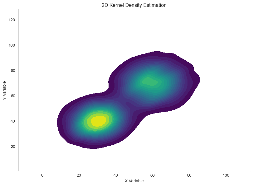
# Use the clustered datafig, ax = plt.subplots(figsize=(10, 7))sns.kdeplot(x=x_clusters, y=y_clusters, cmap='viridis', fill=True, thresh=0.05, levels=20, ax=ax)ax.set_xlabel('X Variable')ax.set_ylabel('Y Variable')ax.set_title('2D Kernel Density Estimation')sns.despine()
2D kernel density estimation provides smooth density surface
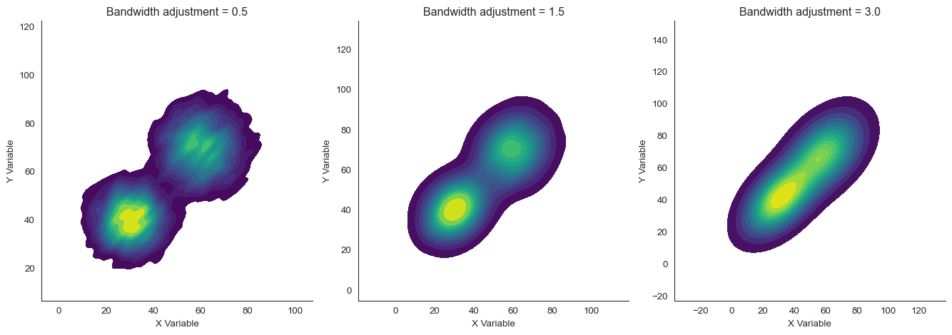
KDE reveals smooth density gradients without arbitrary binning decisions. The key parameter is bandwidth, which controls how wide each kernel is.
Small bandwidth gives high detail but can be noisy. Large bandwidth is smooth but may blur important features.
See the bandwidth effect. With bw_adjust=0.5 (narrow bandwidth), we see fine detail but some noise. With bw_adjust=3.0 (wide bandwidth), the plot is very smooth but the two clusters nearly merge.
The default bw_adjust=1.0 (or around 1.5 here) balances detail and smoothness.
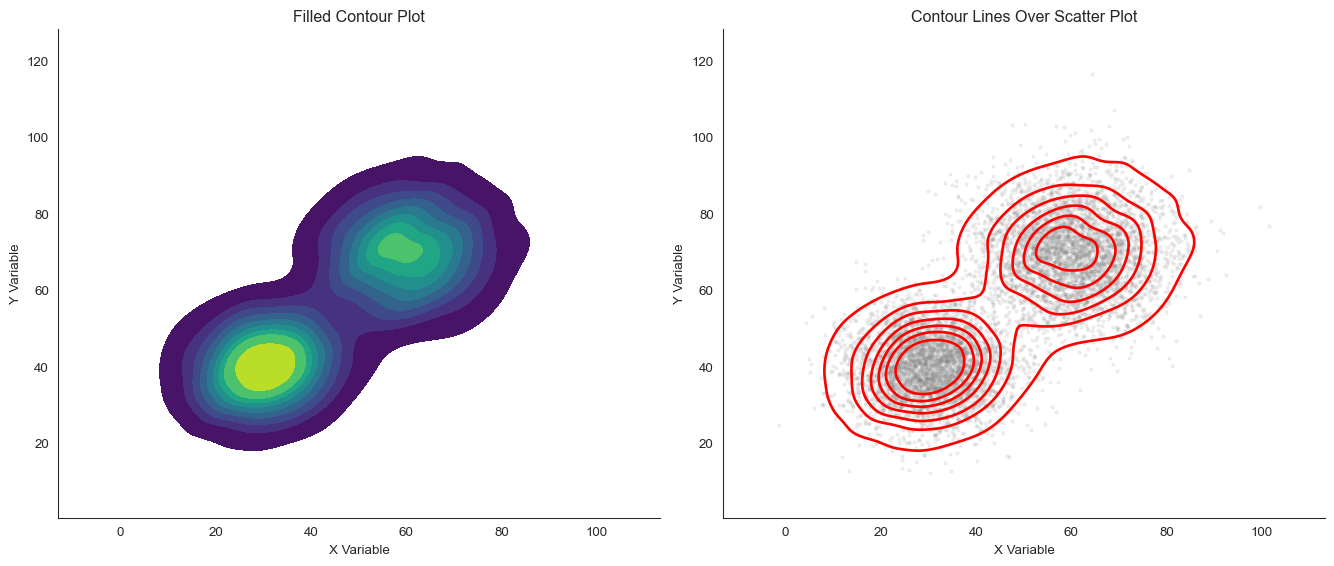
Contour Plots
A contour plot represents the density surface as lines of equal density. Think of it like a topographic map where each contour line represents an “elevation” of density.
When do contour plots shine? They excel at overlaying density information on scatter plots, comparing multiple groups with different colored contours, and showing the “shape” of relationships clearly.
Joint Distributions: Combining 2D and 1D
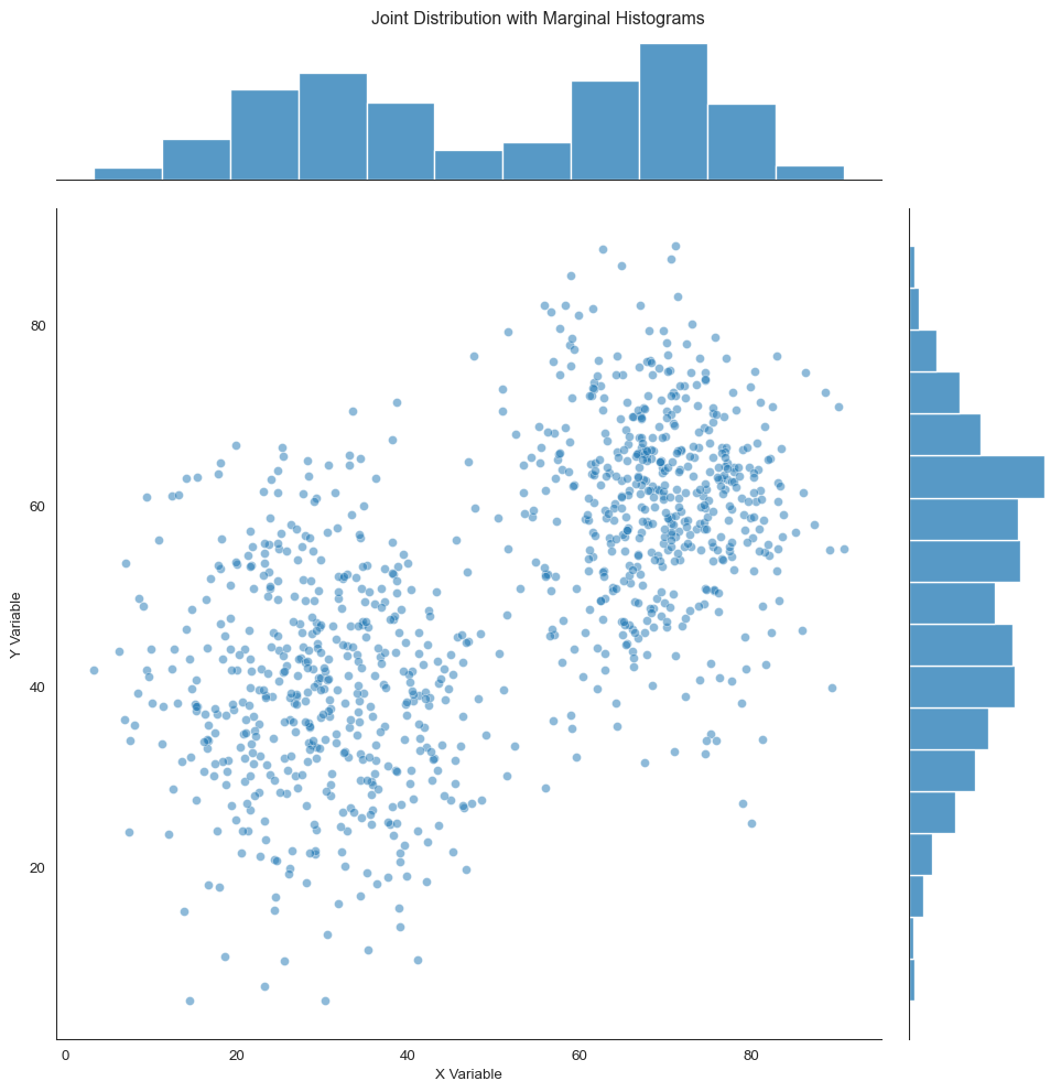
Here’s a powerful approach: show both the joint (2D) distribution and the marginal (1D) distributions of each variable. This connects 2D visualization back to the 1D methods we learned earlier.
What’s a joint plot? It combines a central 2D plot with 1D histograms or density plots along the margins.
Code
# Generate data with interesting marginalsnp.random.seed(202)n =1000x_joint = np.concatenate([np.random.normal(30, 10, n//2), np.random.normal(70, 8, n//2)])y_joint = np.concatenate([np.random.normal(40, 12, n//2), np.random.normal(60, 10, n//2)])# Create joint plotg = sns.jointplot(x=x_joint, y=y_joint, kind='scatter', alpha=0.5, height=10)g.set_axis_labels('X Variable', 'Y Variable')g.fig.suptitle('Joint Distribution with Marginal Histograms', y=1.01)
Text(0.5, 1.01, 'Joint Distribution with Marginal Histograms')
Joint plot combining 2D scatter with marginal 1D distributions
Look at what this reveals. The marginal distributions (top and right) show that both X and Y are bimodal. There are two peaks.
But the scatter plot reveals that the peaks are correlated. When X is low, Y tends to be low. When X is high, Y tends to be high.
This relationship is invisible in the marginals alone.
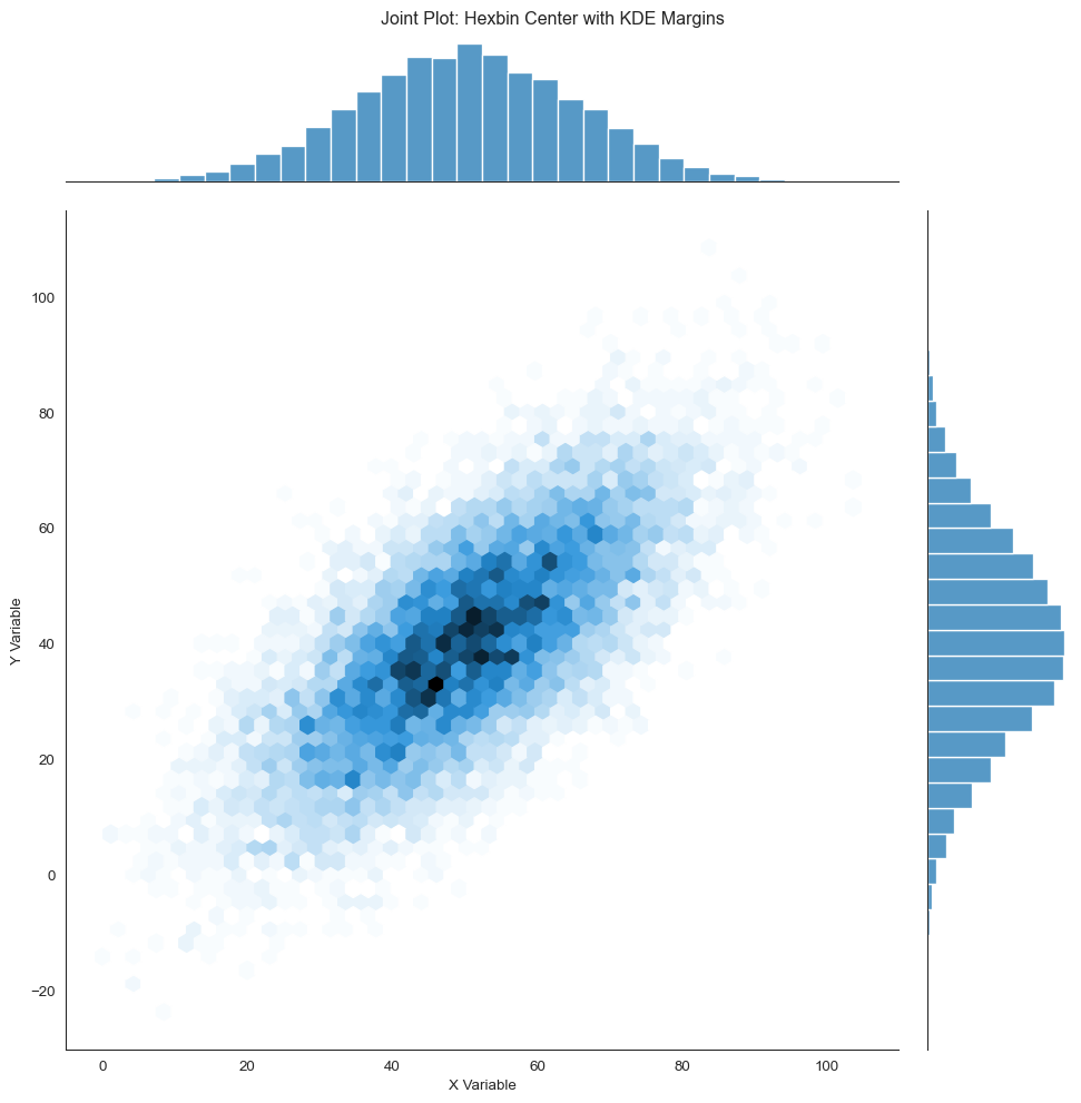
Joint plots can use different visualizations in the center:
Code
# Create joint plot with hexbin and KDEg = sns.jointplot(x=x_large, y=y_large, kind='hex', height=10, marginal_kws=dict(bins=30, fill=True))g.set_axis_labels('X Variable', 'Y Variable')g.fig.suptitle('Joint Plot: Hexbin Center with KDE Margins', y=1.01)
Text(0.5, 1.01, 'Joint Plot: Hexbin Center with KDE Margins')
Joint plot with hexbin center and KDE margins
Or with KDE everywhere:
Code
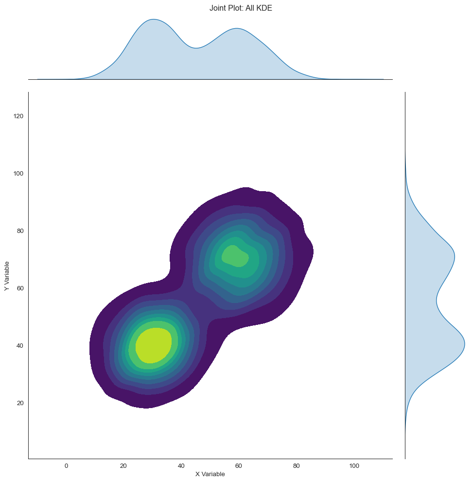
g = sns.jointplot(x=x_clusters, y=y_clusters, kind='kde', height=10, fill=True, cmap='viridis', thresh=0.05)g.set_axis_labels('X Variable', 'Y Variable')g.fig.suptitle('Joint Plot: All KDE', y=1.01)
Text(0.5, 1.01, 'Joint Plot: All KDE')
Joint plot with 2D KDE center and 1D KDE margins
Why use joint plots? They’re particularly useful for understanding if marginal distributions are misleading about the relationship, seeing if there’s correlation between variables with interesting univariate structure, and presenting a complete picture of a bivariate relationship.
Note
Pro tip: When presenting data, start with marginal distributions to establish what each variable looks like. Then show the joint distribution to reveal the relationship. This guides your audience from the familiar (1D) to the complex (2D).
Visualizing Relationships Across Groups
Often we want to compare relationships across multiple groups or categories. There are several effective approaches.
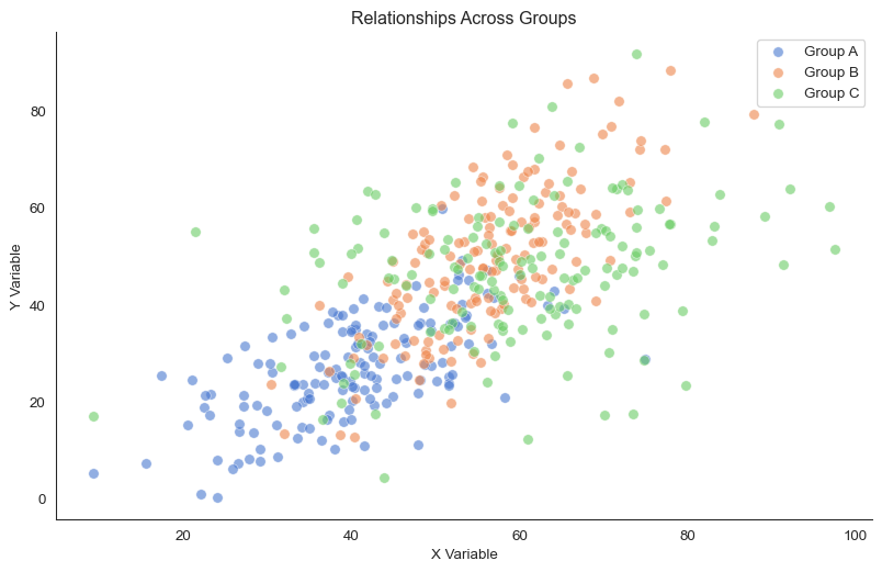
Color coding by group
The simplest approach is to use different colors for different groups:
See the differences? The three groups have different relationships. Group A has a positive moderate slope. Group B has a steeper positive relationship.
Group C? Almost no relationship at all.
Simpson’s Paradox
Be careful! Sometimes the overall trend (pooling all groups) can be opposite to the trend within each group. This is called Simpson’s Paradox. Always visualize groups separately to check if pooling is appropriate.
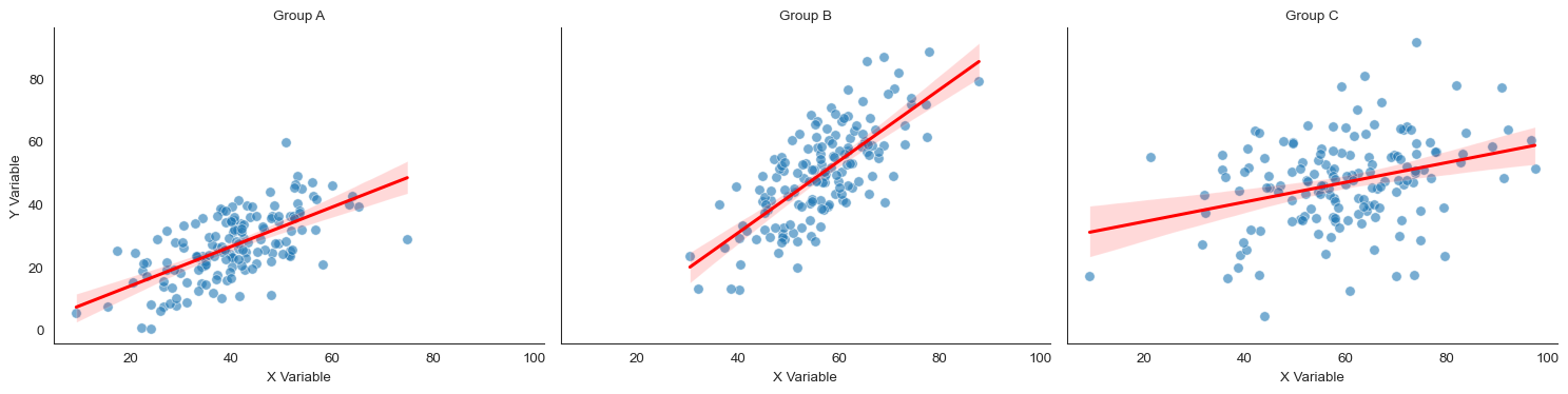
Small multiples (faceting)
When groups overlap heavily or there are many groups, small multiples work better than color coding. Small multiples are separate plots for each group.
/var/folders/j7/9dgqq5g53vnbsbmvh2yqtckr0000gr/T/ipykernel_42895/3335885635.py:12: UserWarning: No artists with labels found to put in legend.  Note that artists whose label start with an underscore are ignored when legend() is called with no argument.
  ax.legend()
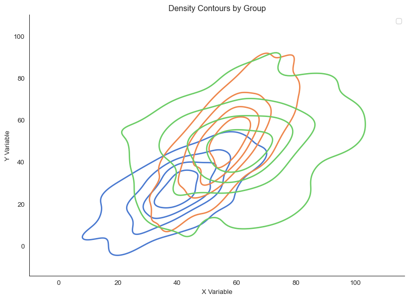
Overlaid density contours reveal different relationship shapes
Look at the shapes. Groups A and B have elongated, correlated distributions. This indicates strong relationships.
Group C is more circular, indicating weak correlation.
The Bigger Picture
Visualizing bivariate relationships isn’t just about making pretty pictures. It’s about seeing patterns that summary statistics conceal.
Think about what happens when you reduce a relationship to a single number. A correlation coefficient, a slope, a p-value. You lose crucial information.
Is the relationship linear or curved? Are there outliers driving the result? Are there subgroups with different patterns? Is the relationship consistent across the range of your data?
Anscombe’s Quartet taught us this lesson half a century ago. Yet papers still report correlations without showing scatter plots. Don’t make this mistake.
The choice of visualization method matters. Use scatter plots for small to moderate datasets where individual points matter. Use hexbin or heatmaps for large datasets where density matters more than individuals.
Use 2D KDE and contours for smooth, assumption-light density estimation. Use joint plots for connecting bivariate relationships to univariate distributions.
But the most important choice is the simplest: always plot your data. Let your audience see what you see. Trust them to interpret patterns, not just summary statistics.
As statistician John Tukey wrote: “The greatest value of a picture is when it forces us to notice what we never expected to see.”