This module introduces dimensionality reduction, a fundamental technique for visualizing and understanding high-dimensional data.
You’ll learn:
What the curse of dimensionality means and why high-dimensional space is counterintuitive.
How to use PCA to preserve global variance structure in linear projections.
The difference between local methods (t-SNE, UMAP) and global methods (MDS, Isomap).
How to choose the right method for your data and avoid misleading visualizations.
High-dimensional space is hostile territory. In our comfortable 3D world, we understand distance and density. But in 50 dimensions, your intuition betrays you: the volume of space explodes, points become lonely wanderers, and “distance” loses its meaning. This is the Curse of Dimensionality.
You can’t plot 50 dimensions directly. Dimensionality reduction bridges this gap, projecting high-dimensional data into 2 or 3 seeable dimensions. But this projection always involves a trade-off. Some methods preserve global structure (the big picture), while others preserve local structure (the neighborhood relationships). Understanding this trade-off is the key to avoiding misleading visualizations.
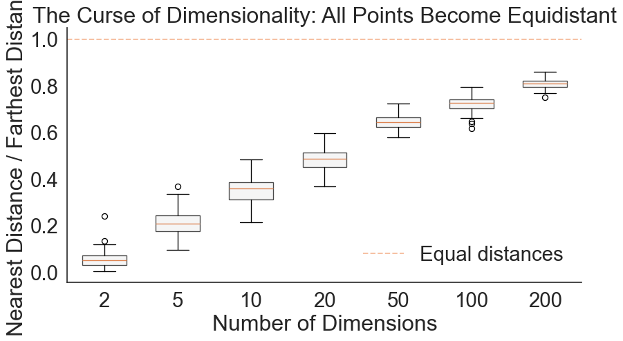
Consider this geometrical nightmare: In 1D, 10 points cover the unit interval nicely. To maintain that same density in 10 dimensions, you don’t need 100 points—you need 10 billion. Even stranger, as dimensions increase, all points become roughly equidistant from each other. The concept of “nearest neighbor” dissolves.
Code
import numpy as npimport matplotlib.pyplot as pltimport seaborn as snsimport pandas as pdfrom sklearn.metrics.pairwise import euclidean_distancessns.set_style("white")np.random.seed(42)# Calculate distance ratio across dimensionsdimensions = [2, 5, 10, 20, 50, 100, 200]n_samples =100ratios = []for d in dimensions:# Generate random data X = np.random.randn(n_samples, d)# Calculate all pairwise distances distances = euclidean_distances(X)# For each point, find nearest and farthest (excluding self) np.fill_diagonal(distances, np.inf) # Ignore self-distance nearest = distances.min(axis=1)# For "farthest," ignore inf (self-distance), so set inf entries to -1 and use argmax temp = distances.copy() temp[temp == np.inf] =-1# Now maximum is truly among finite values farthest = temp.max(axis=1)# Calculate ratio ratio = nearest / farthest ratios.append(ratio)# Plotsns.set(font_scale=2.0)sns.set_style("white")blue, red = sns.color_palette('muted', 2)fig, ax = plt.subplots(figsize=(10, 5))positions =range(len(dimensions))bp = ax.boxplot(ratios, positions=positions, widths=0.6, patch_artist=True, boxprops=dict(facecolor="#f2f2f2", alpha=0.7))ax.set_xticklabels(dimensions)ax.set_xlabel('Number of Dimensions')ax.set_ylabel('Nearest Distance / Farthest Distance')ax.set_title('The Curse of Dimensionality: All Points Become Equidistant')ax.axhline(y=1.0, color=red, linestyle='--', alpha=0.5, label='Equal distances')ax.legend(frameon=False)sns.despine()
As dimensions increase, the ratio of farthest to nearest distance approaches 1
The plot shows a striking pattern: As dimensions increase, the ratio of nearest to farthest distance gets closer to 1. At 200 dimensions, nearly every point is equally far from every other point. This makes clustering impossible since every point becomes equidistant from every other point. By projecting the data into lower dimensions, you can remedy this problem. This is why dimensionality reduction matters for analysis, not just visualization.
Pairwise Scatter Plots: The Brute Force Approach
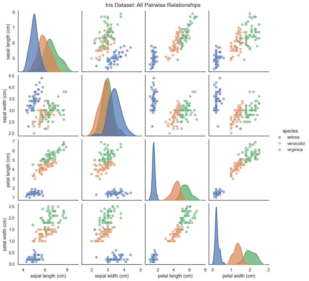
When you have a moderate number of dimensions (roughly 3 to 10), you can visualize all pairwise relationships using a scatter plot matrix, also called a pairs plot or SPLOM.
Text(0.5, 1.01, 'Iris Dataset: All Pairwise Relationships')
Scatter plot matrix showing all pairwise relationships in the Iris dataset
The scatter plot matrix shows every possible 2D projection: the diagonal displays the univariate distribution of each feature using KDE, while off-diagonals show bivariate scatter plots. The problem is clear: scatter plot matrices don’t scale. With 10 variables, you have 45 unique pairwise plots (manageable but crowded). With 20 variables, you have 190 plots (overwhelming). And you’re still only seeing 2D projections, never the full high-dimensional structure. This is where dimensionality reduction becomes essential, projecting the data intelligently onto just 2 or 3 dimensions.
Linear Dimensionality Reduction: PCA
Principal Component Analysis (PCA) is the workhorse of dimensionality reduction. It asks one simple question: “which direction has the most variance?” It rotates your coordinate system so that the first axis (PC1) aligns with the widest spread of data, and the second axis (PC2) aligns with the second widest, perpendicular spread.
The Math: If we center our data matrix X (so columns have zero mean), the covariance matrix is
C = \frac{1}{n-1} X^T X.
We want to find a vector v that maximizes the variance of the projection Xv. This turns out to be an eigenvalue problem:
C v = \lambda v
The eigenvector v with the largest eigenvalue \lambda is the first principal component. The eigenvalue \lambda represents the amount of variance captured by that component.
Code
from sklearn.decomposition import PCA# Generate correlated 2D data (for visualization)np.random.seed(123)mean = [0, 0]cov = [[3, 2], [2, 2]]data_2d = np.random.multivariate_normal(mean, cov, 300)# Fit PCApca = PCA(n_components=2)pca.fit(data_2d)colors = ["#f2f2f2", sns.color_palette('muted')[0], sns.color_palette('muted')[3]]# Plot original data with principal componentsfig, ax = plt.subplots(figsize=(10, 6))ax.scatter(data_2d[:, 0], data_2d[:, 1], alpha=0.9, s=50, color=colors[0], edgecolors='k', linewidth=0.5)# Draw principal components as arrowsorigin = pca.mean_for i, (component, variance) inenumerate(zip(pca.components_, pca.explained_variance_)): direction = component * np.sqrt(variance) *3# Scale for visibility ax.arrow(origin[0], origin[1], direction[0], direction[1], head_width=0.3, head_length=0.3, fc=colors[i+1], ec=colors[i+1], linewidth=3, label=f'PC{i+1} ({variance/pca.explained_variance_.sum()*100:.1f}%)')ax.set_xlabel('Original X')ax.set_ylabel('Original Y')ax.set_title('Principal Components: Directions of Maximum Variance')ax.legend()ax.axis('equal')sns.despine()
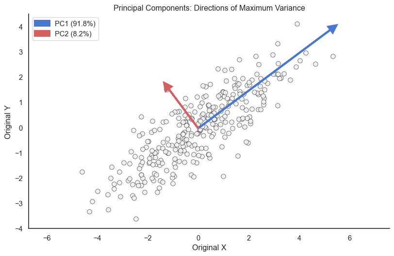
PCA finds directions of maximum variance. PC1 captures the most variation, PC2 the next most (perpendicular to PC1).
PC1 (orange arrow) points along the direction of greatest spread, while PC2 (green arrow) is perpendicular and captures the remaining variation. The percentage shows how much variance each component explains. If PC1 explains 90 percent of variance, projecting onto just PC1 preserves most of your data’s structure.
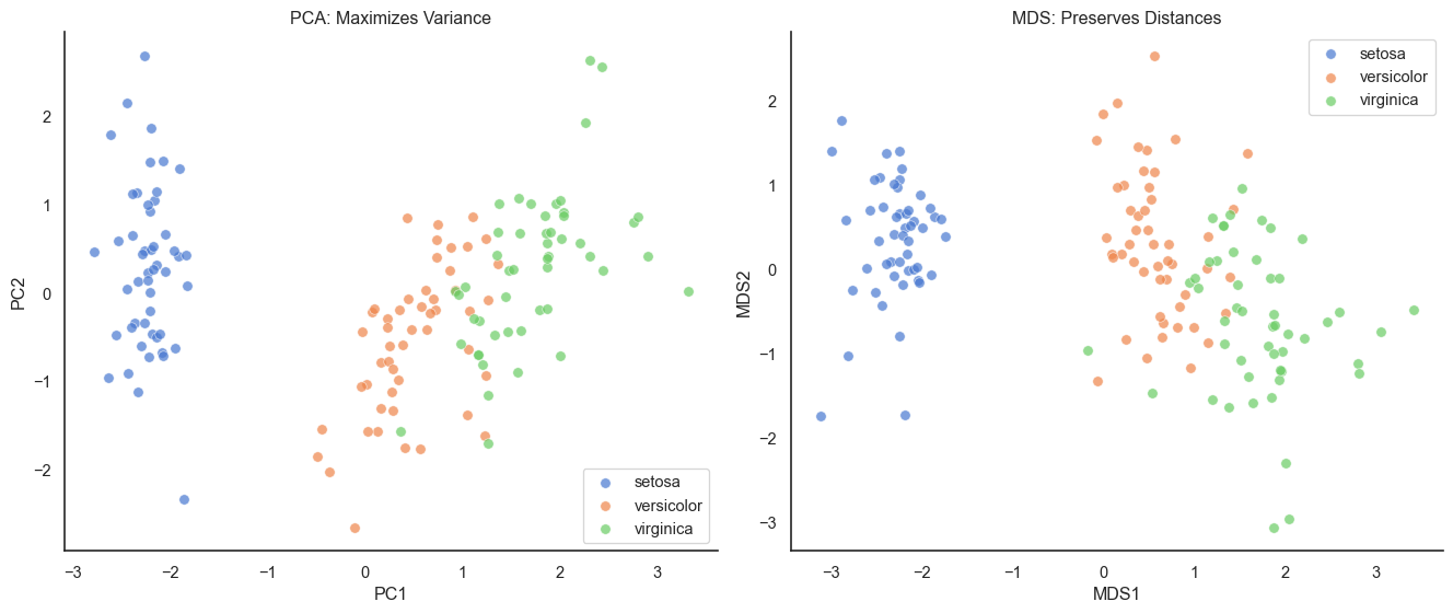
Applying PCA to Iris
Let’s apply PCA to the 4-dimensional Iris dataset and see how much information we can preserve in just 2 dimensions.
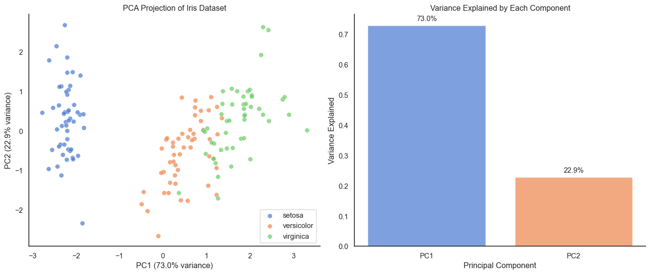
PCA projection of Iris dataset to 2D preserves the separation between species
PC1 and PC2 together explain over 95 percent of the variance in the 4D dataset, with the 2D projection preserving the main structure beautifully (Setosa well-separated, versicolor and virginica showing some overlap just as in the original high-dimensional space). A critical reminder: always standardize before PCA. If features have different units or scales, PCA will be dominated by high-variance features. Standardization (zero mean, unit variance) ensures all features contribute fairly.
Non-Linear Dimensionality Reduction: MDS
Shift your perspective from variance to distances. Multidimensional Scaling (MDS) tries to preserve the pairwise distances between points. Think of it like making a map from a mileage table: you know the distance between every pair of cities in a spreadsheet, but you don’t know where they are on a map. MDS works backward to find coordinates that satisfy those distances.
The Math: Given a high-dimensional distance matrix D where d_{ij} is the distance between points i and j, MDS seeks low-dimensional coordinates y_1, \dots, y_n that minimize the Stress function: \text{Stress} = \sqrt{ \frac{\sum_{i<j} (d_{ij} - \|y_i - y_j\|)^2}{\sum_{i<j} d_{ij}^2} } Minimizing this stress forces the Euclidean distances in the low-dimensional map \|y_i - y_j\| to approximate the original distances d_{ij}.
MDS vs PCA on Iris dataset. MDS preserves distances better but looks similar to PCA for this dataset.
For the Iris dataset, PCA and MDS look very similar. This is because Iris data is fairly linear. The relationships between features don’t involve complex curves or non-linear structures that would cause MDS to differ significantly from PCA.
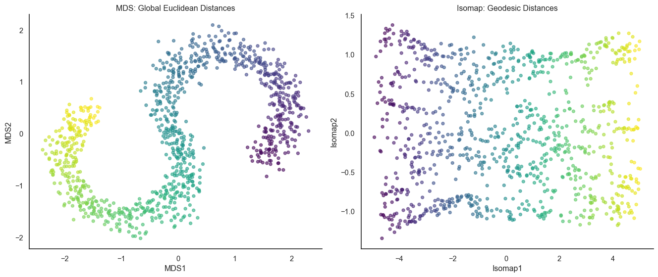
Isomap: Preserving Geodesic Distances
MDS fails on curved surfaces (manifolds) because it respects Euclidean “straight-line” distance. Isomap (Isometric Mapping) fixes this by measuring distance along the surface. It builds a neighborhood graph—connecting only nearby points—and measures distance by hopping along the graph edges. It’s the difference between flying (MDS) and walking (Isomap).
Isomap
The Math: Isomap transforms the problem into MDS by changing the distance metric to follow the data’s underlying manifold. It begins by constructing a neighborhood graph, where points i and j are connected if d_{ij} < \epsilon (epsilon-Isomap) or if j is among the k-nearest neighbors (k-Isomap). Next, it computes the geodesic distances d_G(i, j) as the shortest path distance between nodes in the graph using algorithms like Dijkstra’s or Floyd-Warshall. Finally, classical MDS is applied to this matrix of geodesic distances D_G to find the low-dimensional coordinates.
Code
from sklearn.manifold import Isomapfrom sklearn.datasets import make_s_curve# Generate S-curve data (a 2D manifold embedded in 3D)n_samples =1000X_scurve, color = make_s_curve(n_samples, noise=0.1, random_state=42)# Apply MDSmds_scurve = MDS(n_components=2, random_state=42, n_init=1)X_scurve_mds = mds_scurve.fit_transform(X_scurve)# Apply Isomapisomap = Isomap(n_components=2, n_neighbors=10)X_scurve_isomap = isomap.fit_transform(X_scurve)# Plot MDS vs Isomapfig, axes = plt.subplots(1, 2, figsize=(14, 6))# MDSaxes[0].scatter(X_scurve_mds[:, 0], X_scurve_mds[:, 1], c=color, cmap='viridis', alpha=0.6, s=20)axes[0].set_xlabel('MDS1')axes[0].set_ylabel('MDS2')axes[0].set_title('MDS: Global Euclidean Distances')sns.despine(ax=axes[0])# Isomapaxes[1].scatter(X_scurve_isomap[:, 0], X_scurve_isomap[:, 1], c=color, cmap='viridis', alpha=0.6, s=20)axes[1].set_xlabel('Isomap1')axes[1].set_ylabel('Isomap2')axes[1].set_title('Isomap: Geodesic Distances')sns.despine(ax=axes[1])plt.tight_layout()
Isomap uses geodesic distances (along the surface) instead of Euclidean distances (through space), better recovering the S-curve structure
Isomap successfully “straightens” the S-curve because it respects the manifold structure, computing distances along the neighborhood graph to avoid shortcuts across the bend that confused MDS. The key parameter is n_neighbors. Too few and the graph becomes disconnected with infinite distances. Too many and you create shortcuts across the manifold, reverting to MDS-like behavior. Getting it just right (typically 5 to 15) captures the local manifold structure perfectly.
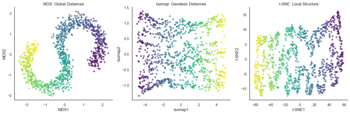
Now we see two extremes emerging: MDS preserves all pairwise distances globally (working on linear or convex data), while Isomap preserves geodesic distances using local neighborhoods (working on curved manifolds). But what if we only care about local structure and global relationships don’t matter?
Modern Non-Linear Methods: t-SNE and UMAP
Global methods like MDS can crush local details. Modern non-linear methods like t-SNE and UMAP take the opposite approach: they prioritize the local neighborhood above all else. They care intensely about keeping friends together, but they care much less about where those groups of friends end up relative to each other. The key insight: For visualization, we almost always care most about neighbors.
How t-SNE works
t-SNE defines “similarity” as a probability. In high dimensions, it measures how likely point i would pick point j as its neighbor (based on a Gaussian curve). In low dimensions, it tries to match that probability using a Student’s t-distribution.
The Math:
High-dimensional Probabilities (P): We define the conditional probability p_{j|i} using a Gaussian kernel centered at x_i, where \sigma_i is tuned to match the desired “perplexity”: p_{j|i} = \frac{\exp(-\|x_i - x_j\|^2 / 2\sigma_i^2)}{\sum_{k \neq i} \exp(-\|x_i - x_k\|^2 / 2\sigma_i^2)} We symmetrize this to get p_{ij} = \frac{p_{j|i} + p_{i|j}}{2n}.
Low-dimensional Probabilities (Q): In the low-dimensional space y, we use a Student t-distribution with 1 degree of freedom (which has heavier tails than a Gaussian): q_{ij} = \frac{(1 + \|y_i - y_j\|^2)^{-1}}{\sum_{k \neq l} (1 + \|y_k - y_l\|^2)^{-1}}
Optimization: We minimize the Kullback-Leibler (KL) divergence between P and Q using gradient descent: C = KL(P||Q) = \sum_{i \neq j} p_{ij} \log \frac{p_{ij}}{q_{ij}}
The t-distribution’s heavy tails are clever. They let well-separated clusters spread out in 2D without overlapping, while keeping local neighborhoods tight.
Code
from sklearn.manifold import TSNE# Apply t-SNEtsne = TSNE(n_components=2, random_state=42, perplexity=30)X_scurve_tsne = tsne.fit_transform(X_scurve)# Plot all three methodsfig, axes = plt.subplots(1, 3, figsize=(15, 5))# MDS - Global Euclidean distancesaxes[0].scatter(X_scurve_mds[:, 0], X_scurve_mds[:, 1], c=color, cmap='viridis', alpha=0.6, s=20)axes[0].set_xlabel('MDS1')axes[0].set_ylabel('MDS2')axes[0].set_title('MDS: Global Distances')sns.despine(ax=axes[0])# Isomap - Geodesic distancesaxes[1].scatter(X_scurve_isomap[:, 0], X_scurve_isomap[:, 1], c=color, cmap='viridis', alpha=0.6, s=20)axes[1].set_xlabel('Isomap1')axes[1].set_ylabel('Isomap2')axes[1].set_title('Isomap: Geodesic Distances')sns.despine(ax=axes[1])# t-SNE - Local neighborhoodsaxes[2].scatter(X_scurve_tsne[:, 0], X_scurve_tsne[:, 1], c=color, cmap='viridis', alpha=0.6, s=20)axes[2].set_xlabel('t-SNE1')axes[2].set_ylabel('t-SNE2')axes[2].set_title('t-SNE: Local Structure')sns.despine(ax=axes[2])plt.tight_layout()
Comparing global, geodesic, and local approaches on the S-curve
All three methods successfully straighten the S-curve through different philosophies: MDS compromises between all distances, Isomap follows the manifold globally, and t-SNE focuses on preserving neighborhoods. The key parameter in t-SNE is perplexity (typically 30 to 50), which controls the effective neighborhood size. Too low perplexity fragments clusters, too high perplexity loses local detail.
When t-SNE works and fails
t-SNE is useful and widely used for high-dimensional data visualization. Yet, it sometimes falls in short. See this blog for more details, which shows numerious examples of t-SNE visualization that are not what we expect.
What t-SNE preserves (and what it doesn’t)
t-SNE is powerful but has important limitations. It preserves local structure (keeping points that are neighbors in high dimensions as neighbors in 2D), preserves clusters (keeping well-separated groups separated), and preserves relative relationships within neighborhoods (if A is closer to B than to C locally, this is preserved). What t-SNE does NOT preserve: actual distances between points, the relative position of distant clusters (arbitrary), cluster sizes (large clusters may appear smaller and vice versa), or densities (tight clusters may spread out, sparse regions may appear dense).
You cannot conclude that “cluster A is twice as far from B as from C” (distances not preserved), “cluster A is twice the size of B” (sizes not preserved), or “the data has exactly 5 clusters” (apparent clusters may be visualization artifacts). You can conclude that “these points form a distinct group separate from others,” “these points are more similar to each other than to distant points,” and “the data has local structure and is not uniformly random.”
Applying t-SNE to real data
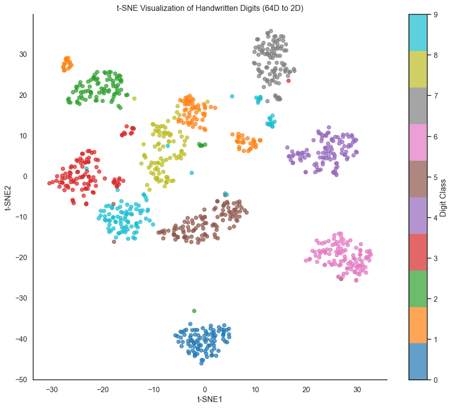
Let’s apply t-SNE to a more realistic high-dimensional dataset: the digits dataset, which has 64 dimensions (8 by 8 pixel images).
Code
from sklearn.datasets import load_digits# Load digits dataset (8x8 images, 64 dimensions)digits = load_digits()X_digits = digits.datay_digits = digits.target# Take a subset for speed (t-SNE is slow on large datasets)np.random.seed(42)indices = np.random.choice(len(X_digits), size=1000, replace=False)X_subset = X_digits[indices]y_subset = y_digits[indices]# Apply t-SNEtsne_digits = TSNE(n_components=2, random_state=42, perplexity=40)X_digits_tsne = tsne_digits.fit_transform(X_subset)# Plotfig, ax = plt.subplots(figsize=(12, 10))scatter = ax.scatter(X_digits_tsne[:, 0], X_digits_tsne[:, 1], c=y_subset, cmap='tab10', alpha=0.7, s=30)ax.set_xlabel('t-SNE1')ax.set_ylabel('t-SNE2')ax.set_title('t-SNE Visualization of Handwritten Digits (64D to 2D)')cbar = plt.colorbar(scatter, ax=ax, ticks=range(10))cbar.set_label('Digit Class')sns.despine()
t-SNE visualization of handwritten digits (64 dimensions to 2D). Each color represents a digit class.
The t-SNE projection beautifully separates most digit classes, with similar digits (3, 5, and 8) clustering near each other while visually distinct digits (0 and 1) are well separated. This demonstrates t-SNE’s power: from 64 dimensions with no explicit information about what makes digits similar, t-SNE discovers the perceptual structure of handwritten digits. An important note: t-SNE is stochastic. Different runs produce different layouts (though cluster structure remains consistent), so always check multiple runs with different random seeds, especially for scientific conclusions.
UMAP: A Faster Alternative
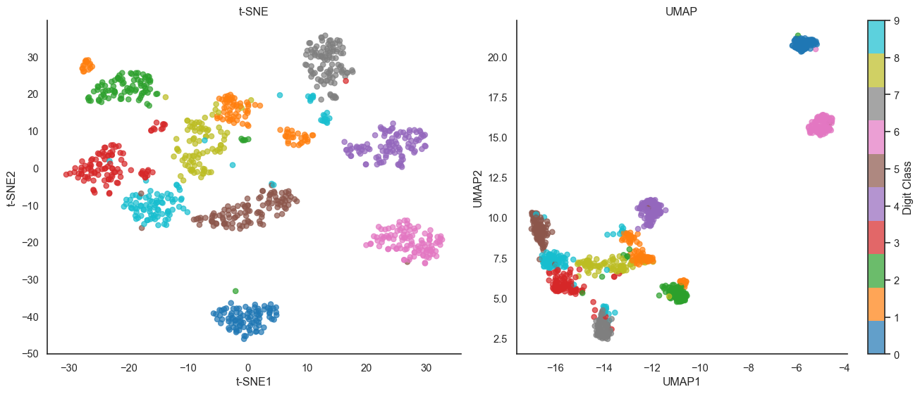
Uniform Manifold Approximation and Projection (UMAP) is a newer method from 2018 that has become popular as an alternative to t-SNE. Like t-SNE, UMAP preserves local structure, but it’s based on different mathematical foundations in manifold learning and topological data analysis. UMAP has several advantages over t-SNE: it’s faster (often 10 to 100 times faster on large datasets), scales better (working well on datasets with millions of points), preserves more global structure, and is theoretically grounded in Riemannian geometry and fuzzy topology.
The Math: UMAP relies on fuzzy simplicial sets and a different cost function.
Local Connectivity: It computes high-dimensional probabilities p_{ij} using a specific local connectivity constraint: p_{j|i} = \exp\left(-\frac{d(x_i, x_j) - \rho_i}{\sigma_i}\right) where \rho_i is the distance to the nearest neighbor. This ensures every point is connected to at least one neighbor.
Binary Cross-Entropy: Instead of KL divergence, UMAP minimizes the fuzzy set cross-entropy: C = \sum_{i \neq j} \left[ p_{ij} \log \left(\frac{p_{ij}}{q_{ij}}\right) + (1 - p_{ij}) \log \left(\frac{1 - p_{ij}}{1 - q_{ij}}\right) \right] The second term (1 - p_{ij}) \log (\dots) forces points that are far in high dimensions to also be far in low dimensions, helping UMAP preserve more global structure than t-SNE.
/Users/skojaku-admin/Documents/projects/applied-soft-comp/.venv/lib/python3.12/site-packages/umap/umap_.py:1952: UserWarning: n_jobs value 1 overridden to 1 by setting random_state. Use no seed for parallelism.
  warn(
UMAP vs t-SNE on digits dataset. UMAP often preserves more global structure while being much faster.
Both methods reveal similar cluster structure, but UMAP tends to space clusters more evenly and preserve more global topology (notice how UMAP places similar digits like 3, 5, 8 in a connected region, suggesting they share underlying structure).
Try it yourself
Take a dataset you’re familiar with and apply all four methods: PCA, MDS, t-SNE, and UMAP. Compare the results. What structure does each method reveal? What structure does each method hide? Which visualization best matches your intuition about the data?
Remember the golden rule: Dimensionality reduction is a lie. It lies about distance, density, or topology to fit a complex world onto a flat screen. Use these visualizations to generate hypotheses, but never trust them blindly. As Jake VanderPlas wrote, “The question is not whether you lose information (you always do) but whether you lose the information you care about.”